If you want to make your game more enjoyable, you have to start with the user interface. The UI is one area where I feel Stellaris lags behind other franchises. I get that it’s a complex game, but sometimes it feels like I’m looking through a seedy internet site looking for torrents without an ad blocker. Luckily, it’s also one area that modders have put a lot of effort into fixing. Let’s take a look at what they’ve come up with!
8. Dark UI
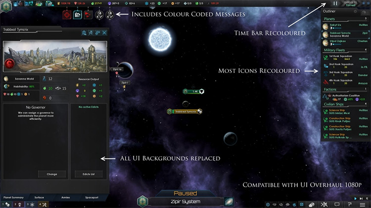
Check Out This Mod Not everyone likes the greenish vanilla hue of Stellaris’ UI elements. It mimics a sci-fi holographic display, which was interesting the first few times I played but quickly got old. Taking a cue from almost every modern smartphone app, Dark UI serves as Stellaris’ “Night Mode,” replacing the odd green hue with a neutral palette of black, gray, and dark blue. This makes playing for extended periods less visually tiring and overall gives the game a more stylish look.
7. Planetary Diversity – Planet View
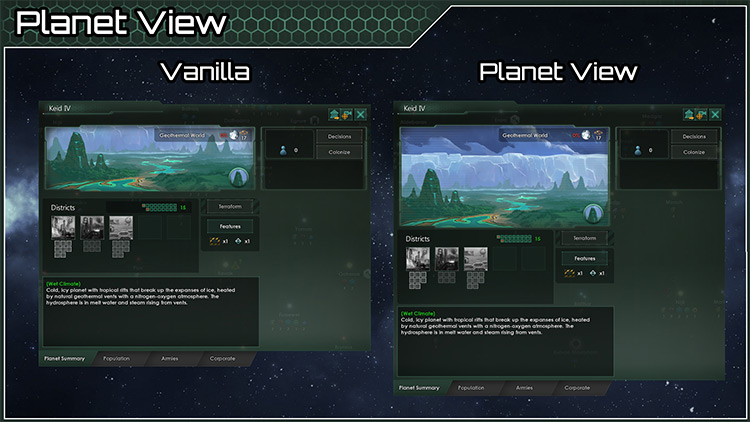
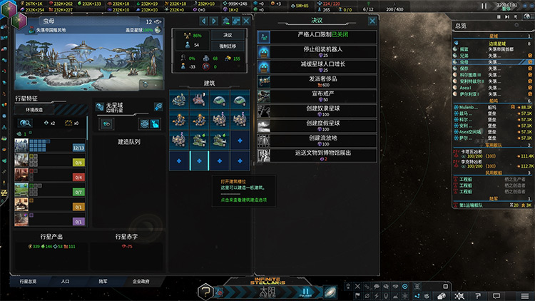
Check Out This Mod You need to use your imagination to truly enjoy Stellaris. It’s built into the game! They give you only the most basic visual feedback for other species, the galaxy, and your planets. You’re supposed to imagine the rest. Still, after playing around with so many new planet mods and the like, I wish I could see more of them. The Planetary Diversity – Planet View mod helps out by expanding the size of the planet surface artwork in the planet viewer. You’ll get a more complete picture, and it won’t all be obscured by your planet modifiers.
6. Immersive Simple Map UI
Check Out This Mod One of the hardest things to do when starting out with Stellaris is understanding the interface and, even more importantly, the map. There is a lot of information, and it’s actually hard to see the stars and planets behind the massive banners hovering over every starbase, planet, mining or research hub, and ship. Immersive Simple Map UI can improve your map navigating experience by reducing the size of these banners/tags to the minimum necessary – generally just a small icon and some letters in the void. It’s minimal, straightforward, and much easier to understand for beginners.
5. Enhanced UI Project
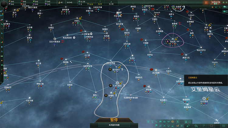
Check Out This Mod An even more in-depth rework of the system and galaxy map UI you have to check out if you believe in minimal interfaces is the Enhanced UI Project. In addition to reducing the excessive size of the base game’s banners and icons, the mod selectively increases some icons’ size and simplifies their design to make them easier to tell apart. Something else I love about Enhanced UI Project is that it streamlines finding points of interest like anomalies and excavations by making their icons more visible and identical between the galaxy and system maps.
4. Foxt’s Minimalist UI
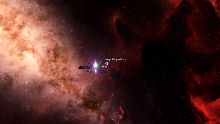
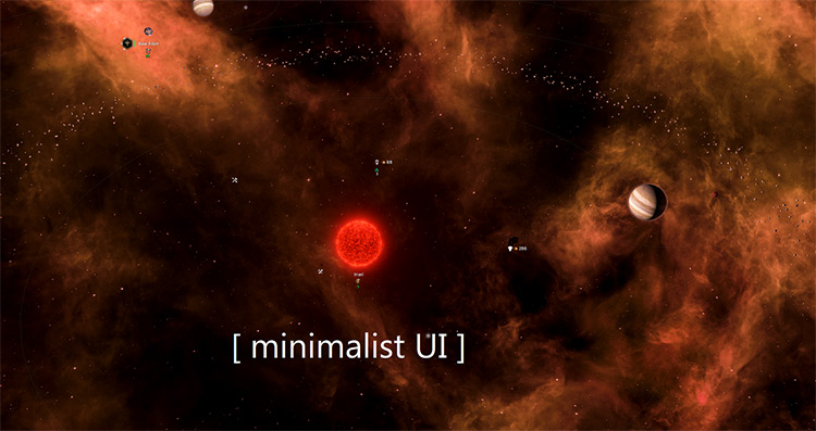
Check Out This Mod I know some of you guys can’t stand that Stellaris doesn’t have some sort of “Hardcore” mode like Call of Duty where you can play with no UI. You crave having to remember the names of your planets and systems from memory and keeping track of your fleets the old-fashioned way with a hand-made map of the galaxy and some chess pieces. Foxt’s Minimalist UI is the closest you’ll get to that fantasy. This mod reduces every map UI element to its minimum expression, making them almost invisible in system view so you can better appreciate the natural beauty of your clusters or the glory of your fleet. I recommend this for experienced players who know the game like the back of their hands.
3. Tiny Outliner
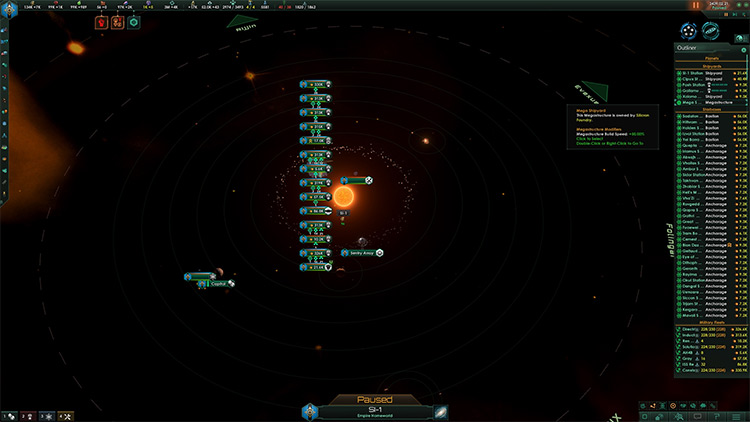
Check Out This Mod Sometimes, all you need is a small change to massively improve your experience. Tiny Outliner is that small change. The outliner to the right of the screen in Stellaris is key to navigating your planets, starbases, and both civilian and military vessels. Without it, you’d have to navigate to each thing manually, and it would be impossible to keep track of what every ship is doing. This mod flattens every tab in the outliner, so you don’t have to scroll down to find what you’re looking for. Before, you could only keep track of around 12 things. Now it’s about 50.
2. UI Overhaul Dynamic
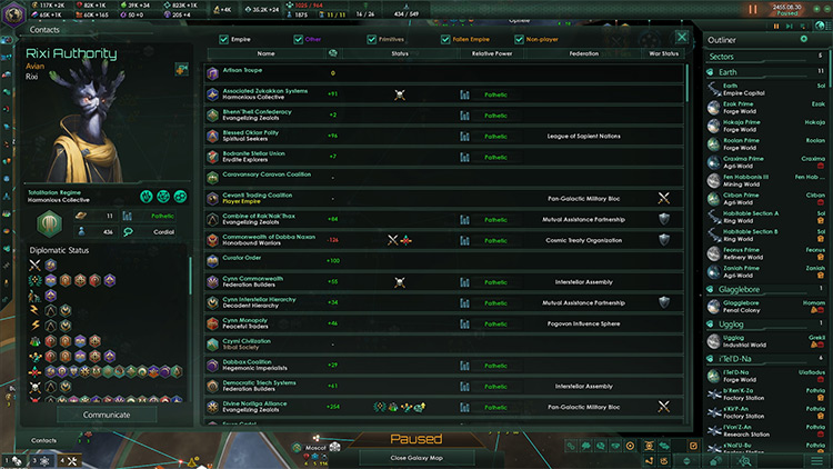
Check Out This Mod Most of us don’t really want to add even more mods to our already bursting load order, so I value mods that give me the whole package in a single download. UI Overhaul Dynamic is your one-stop interface enhancement solution, adjusting almost every visible part of the UI for a more visually appealing and easy-to-navigate experience. Among other things, the mod forces the UI to resize itself depending on user resolution. It also rescales most pop-up windows, increases the height of lists, and repositions specific icons for ease of use. In addition, this mod fully overhauls the Ship Designer and Fleet Manager screens to make assembling a star-destroying fleet much more enjoyable.
1. Dark Blue UI Remake
Check Out This Mod The UI Overhaul Dynamic mod is a thing of beauty, but the point of mods is allowing gamers to customize their games to the smallest detail – and I know some of you still resent the interface’s green tinge. The Dark Blue UI Remake is an add-on to UIOD that makes your game even more stylish, with a new black, gray, and dark blue color palette and a wealth of smaller graphical adjustments. It also makes every entry in the outliner a lot more compact without sacrificing information. You’ll have to try Dark Blue UI to find out everything it offers – but you won’t go back once you check it out.
